As a startup, a website is necessary for your business because everybody’s online now. You don’t want to be the only brand without a digital office where clients can reach you in just a few clicks. But which of the website design trends will you choose?
So, you’ve decided to build a website for your startup, and you have no idea where to start—we’ve been there too.
What’s website design all about? Your website hosts most information about the business, so you need a design that emphasises your preferred point. Just like we say, “How you appear is how you’re judged,” it’s the same with website design for startups.
But what’s the best website design for startups? In this blog, I’ll share the top 10 website design trends in 2026. You’ll definitely find one for your startup website.
-
Brutalism
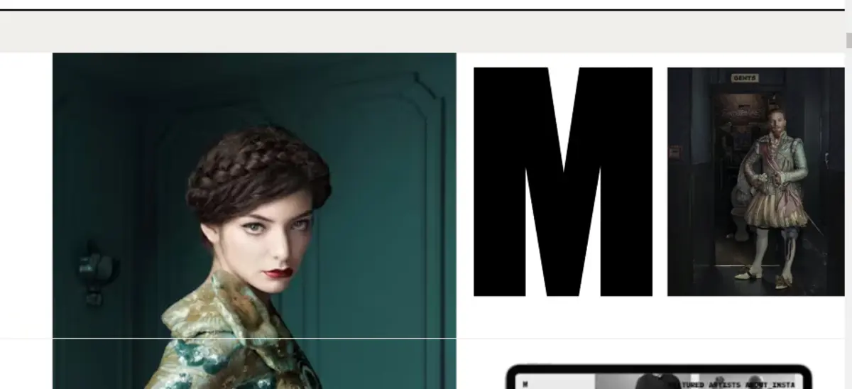
I picked this one first for its unique nature—it contrasts vividly with all other designs and is very easily recognized. While it’s hard to define brutalism (it’s not one style but a collection of styles), one look at the non-conformative design of a website reveals the truth.
Where other website design trends possess a structured and obedient aura, Brutalism designs emphasise raw, unpolished, and chaotic themes. This design features bold typography (large, bold fonts) to draw more attention to the text, high-contrast colour schemes (brutal for a reason), and minimalist graphics to lay more emphasis on content.
The main motto of brutalism is improved functionality over ornamentation—I like that part. This means faster page load speed and straight-to-the-point content! I love it. It just stands out from the crowd and creates a memorable experience for users.
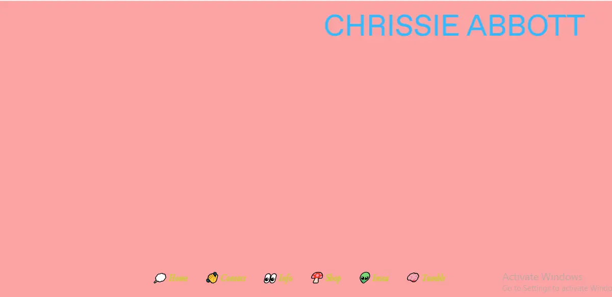
Derek McKechnie is a perfect example of a brutalist website. The website’s filled with sharp-edged objects that become interactive once visitors click around. Another example is Chrissie Abbot.
While it’s great for page speed, it’s difficult to navigate sometimes, and not everyone likes it.
-
Structured typography
This one’s the opposite of brutalism. Structured typography is all about stability and structure. After the pandemic, most consumers craved something unsurprising, something that seemed unchanging and reliable, which pushed the structured website design trends.
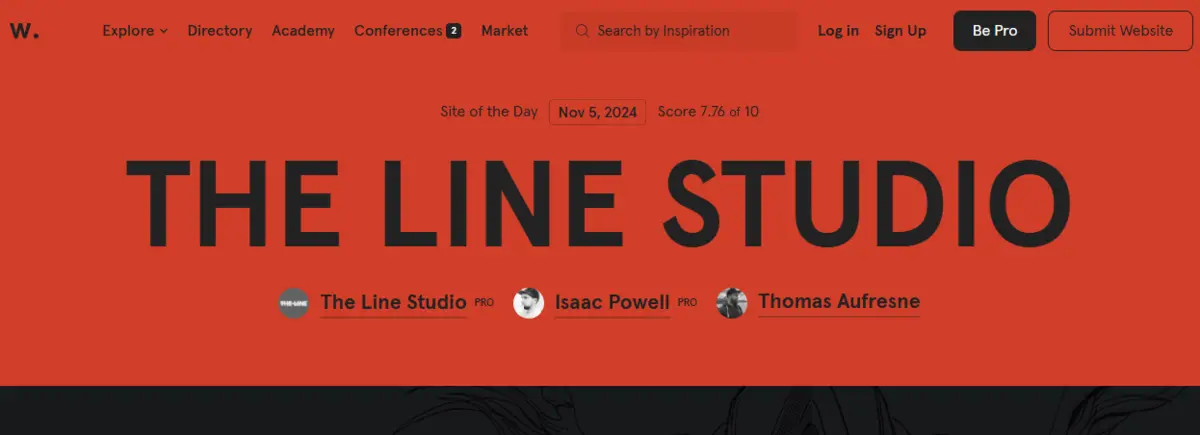
Imagine capital letters, bold shapes, and solid colours. No surprises; very clear and efficient. What I like about the structure typography is the straightforwardness. The design tells you where to look, so there’s no need to look all over the page for information. A prime example of structured typography design is the Awwwards home page.
-
Cinematographs
This is also one of the website design trends I love. Motion is the deal among web designers this year, and cinematographs conform to the trend.
Cinematographs are high-quality videos that run on a continuous loop. You’re sure to find little boxes of it sprinkled here and there on websites with this theme.
I like the attention-grabbing feature of cinematographs, but they’re not really easy on the eyes (for visitors with sensitive eyesight). So, if your ideal visitor’s prone to eye issues, cinematographs are not the best option for your startup’s website. Check out Graphik to understand this website design trend.
-
Kinetic Typography
In the 1960s, films began to use animated openings to grab viewers attention. Although the practice dwindled to nothing, it worked its way up to the top 2026 website design trends.
Rather than plain stationary text, web designers use moving texts to highlight important sections and gradually reveal information. A perfect example of kinetic typography is gravity global.
I particularly like how this trend captivates the audience. It’s proven to keep visitors fixated on the message and help them digest the gist. Although it’s visually appealing, slow readers may find it discomforting.

-
Experimental Navigation
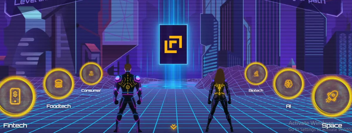
Rather than the usual horizontal navigation block at the top of the page, more websites try out newer ways to help visitors move between pages. Now there are just so many creative ways for visitors to explore the website, and designers haven’t relented one bit.
Check out level one, and you’ll realise your menu doesn’t have to be at the top or vertical.
What I like about this website trend is how you can express your brand’s voice through the navigation. You can play around with a few ideas and unleash that pent-up creativity.
I’d say there’s no shortcoming for experimental navigation—it’s all sunshine and rainbows.
-
Text-only
In 2026, many web design agencies are experimenting with text-only website design. It’s a new approach to an uncluttered, clean approach to presenting information to visitors. This design embraces minimalism, and with images entirely out of the equation, the texts whisper loudly.
One thing about the text-only design I love is the absence of noise. If you’re looking for a design that screams elegance and poise, it’s a great pick. While I doubt if any website could go wrong using it, it requires a bit of craft and nuance to get right.
Quick tip: text-only doesn’t mean boring. Ditch the traditional typography rules and choose interesting texts. Also play around with colour contrast between texts and background.
Check Dash’s homepage for a prime example of text-only design.

-
Ultra Minimalism
Website design trends have come and gone, but minimalism remained unfazed. In fact, it evolved into a deeper version, ultraminimalism.
Some websites refuse to conform to the web design stereotypes, and they strip away every necessity to the bare minimum. This is among the website design trends that agree with the demand for faster page load speed and user experience. If you’re creating an online store, this is one of the website design trends to use.
Although it gives off a “no-effort” vibe, it actually takes a trained eye to pull off. Creating an ultra minimalist website design requires a skilled eye to know what element stays or which goes and a deep understanding of typography, colour theory, negative space, etc.
We Ain’t Plastic is simple in colour and design, making it the perfect example for the ultra-minimalist design.

-
3D Design
Gone are the days of flat pictures and illustrations; 2026 website trends are about making every visit interactive and unforgettable. Now, websites, especially gaming websites, embrace the creative trend of 3D designs to create a ‘living” website.
I like the playfulness and cuteness overload of this website trend. It hints at the Japanese kawaii culture that dabbles in pastel colouring and childlike objects. Importantly, it makes your visitors stay longer on your website.
Check out ARC Studios for a visual example of 3D design.

-
Y2K-inspired Design
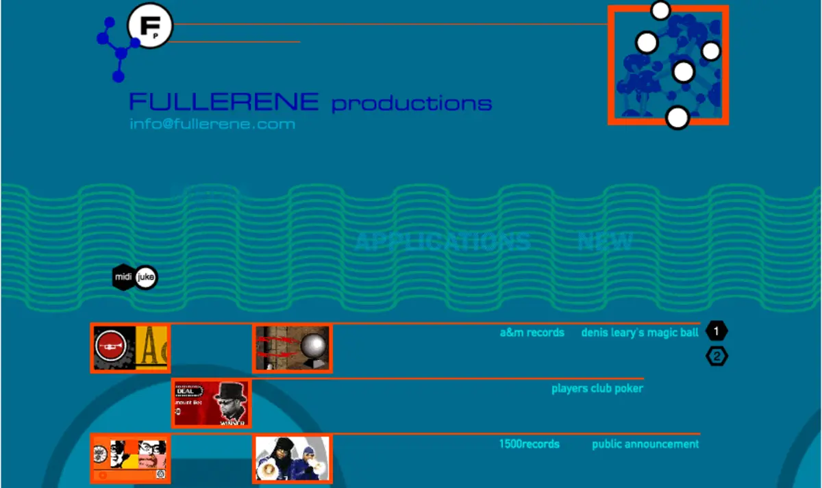
Everyone feels nostalgic at one point or another, and website designers capitalise on this in 2026. Since 2020, the demand for Y2K aesthetics has grown steadily, and in 2026, we will have a full-blown Y2K-inspired website trend.
The goal is to transport visitors back in time—to the 2000s—with colours, fonts, and even memorabilia from then. The Web Design Museum has some examples to boost inspiration. There’s every reason to believe the Y2K-inspired design will rank among website design trends for 2026.
-
Natural or Organic Textured Design
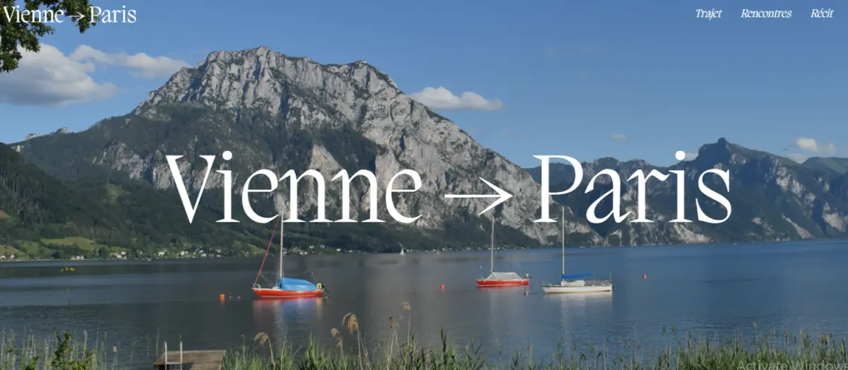
Natural and organic textures are redefining web design in 2026 with the way it brings visitors closer to Mother Nature with symbolic graphics and fonts. Emphasising grainy backgrounds, subtle imperfections, and soft, organic shapes, this trend creates inviting, authentic user experiences that feel closer to nature.
It’s growing viral for its warmth and personality, especially among eco-conscious brands. Check out Vienna to Paris as an example.
Wrapping it up…
Of course you can’t use all these designs on one website, but you’ll be fine combining 2 website design trends. This allows you to satisfy a wider range of visitors, grow blog traffic, increase engagement time, and eventually boost the conversion rate.
Here’s a startup web design tip for you
When choosing a website design, the right question isn’t “do we like it?” but “will this convert?”. It helps pick the most suitable design for your goal. Finally, you must optimize your website to attract growth and conversions.
The Techdella team writes about startup marketing strategy, growth tactics, and what actually works when you're building a company with real constraints.
Get it in your inbox
One email a week. Real startup marketing insights — no filler.
Join 1,400+ founders. Unsubscribe anytime.
You're in!
Thanks for subscribing. Your first issue will arrive shortly.
